Redesign LMU magazine website which is an online publication that competes with the most sophisticated, professional journals occupying the magazine marketplace.
Credits
Consultancy: Advant InteractiveRole: UI/UX designer
Responsibility: User research, Wireframe, Protyping, Visual design Team: Maureen Pacino, Senior director of communications and creative Services, Joseph Wakelee-Lynch, Magazine editor & Copy editor, Jon Rou, Photographer, Yoshikazu Ysa, Video production manager, Guy Silliman, Project manager, Taylor Polk, Digital solutions manager
︎︎︎Visit magazine.lmu.edu

Overview
This project involves the redesign of LMU magazine website to match the university's rebranding efforts and improve user experience. The goal is to create a visually appealing, mobile-responsive website that effectively disseminates information to a wide audience through articles, news, videos, and podcasts.
Project duration
This design project took 6 months to complete, which included user research, ideation, design, and implementation to WordPress, as well as updates to match the current issue contents.
The Problem
The Goal
This project involves the redesign of LMU magazine website to match the university's rebranding efforts and improve user experience. The goal is to create a visually appealing, mobile-responsive website that effectively disseminates information to a wide audience through articles, news, videos, and podcasts.
Project duration
This design project took 6 months to complete, which included user research, ideation, design, and implementation to WordPress, as well as updates to match the current issue contents.
The Problem
Students and web editors are struggling with the outdated and difficult-to-navigate LMU magazine website, which is not mobile-responsive and does not follow the current branding. This is causing reputational damage to the award-winning magazine and could result in a loss of advertising opportunities for the university.
The Goal
- Develop a visually appealing and mobile-responsive website for the LMU magazine that aligns with the university's rebranding efforts.
- Improve user experience for students and web editors by creating an easy-to-navigate website that is up-to-date and follows the current branding guidelines.
- Effectively update information to a wide audience through engaging articles, news, videos, and podcasts that showcase the magazine's unique visual aesthetic and quality content.
Understanding the user
We conducted user research to gain a better understanding of the target audience's needs and behaviors. Initially, we assumed that the target audience consisted mainly of LMU students and alumni. However, our research revealed that the audience was more diverse, including parents, prospective students, donors, and community members. We also discovered that the audience preferred consuming content through mobile devices, and they were looking for more interactive and visually appealing content. Our user research helped us create personas and empathy map that informed the website design and content strategy.
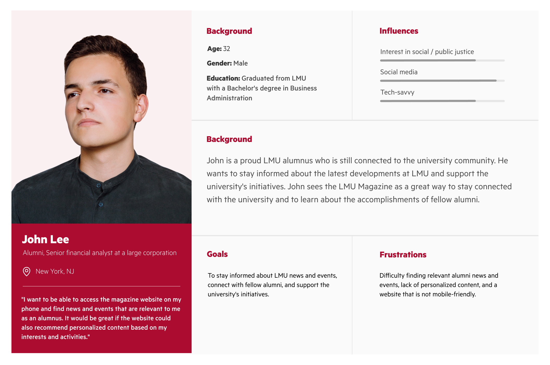
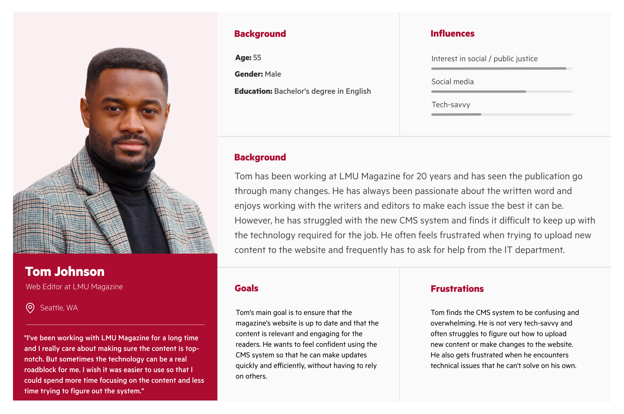
Persona
The project aims to serve a diverse group of users with different needs and goals. The project seeks to create an engaging, user-friendly website that caters to the interests of students, alumni, community members, and the web editor.


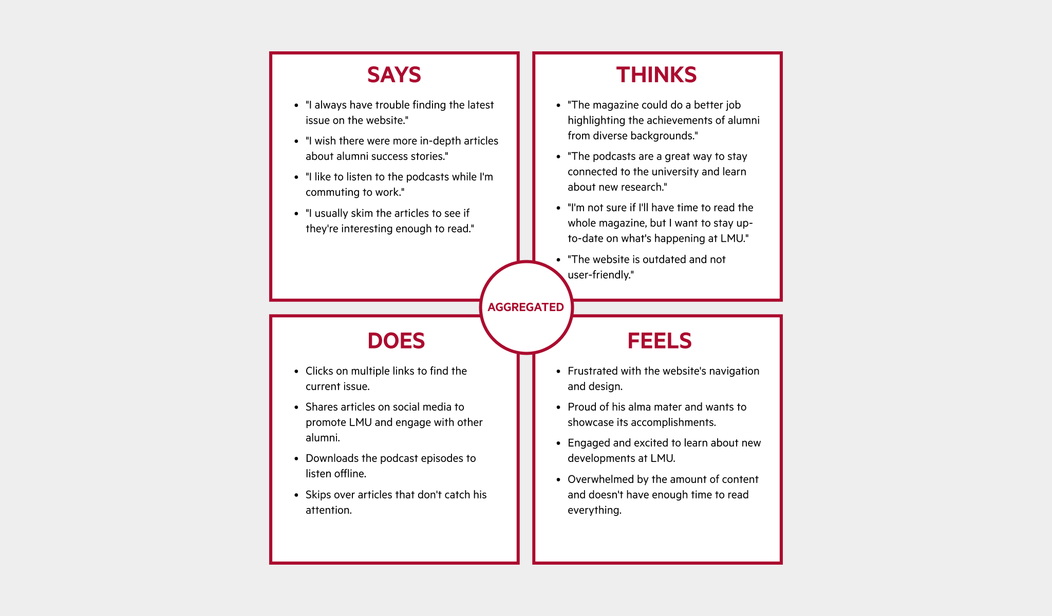
Empathy map
In order to better understand the needs and behaviors of our users, I created an aggregated empathy map based on observations and research. This map highlights four key traits demonstrated by the users and provides insights for designing a user-centered website.
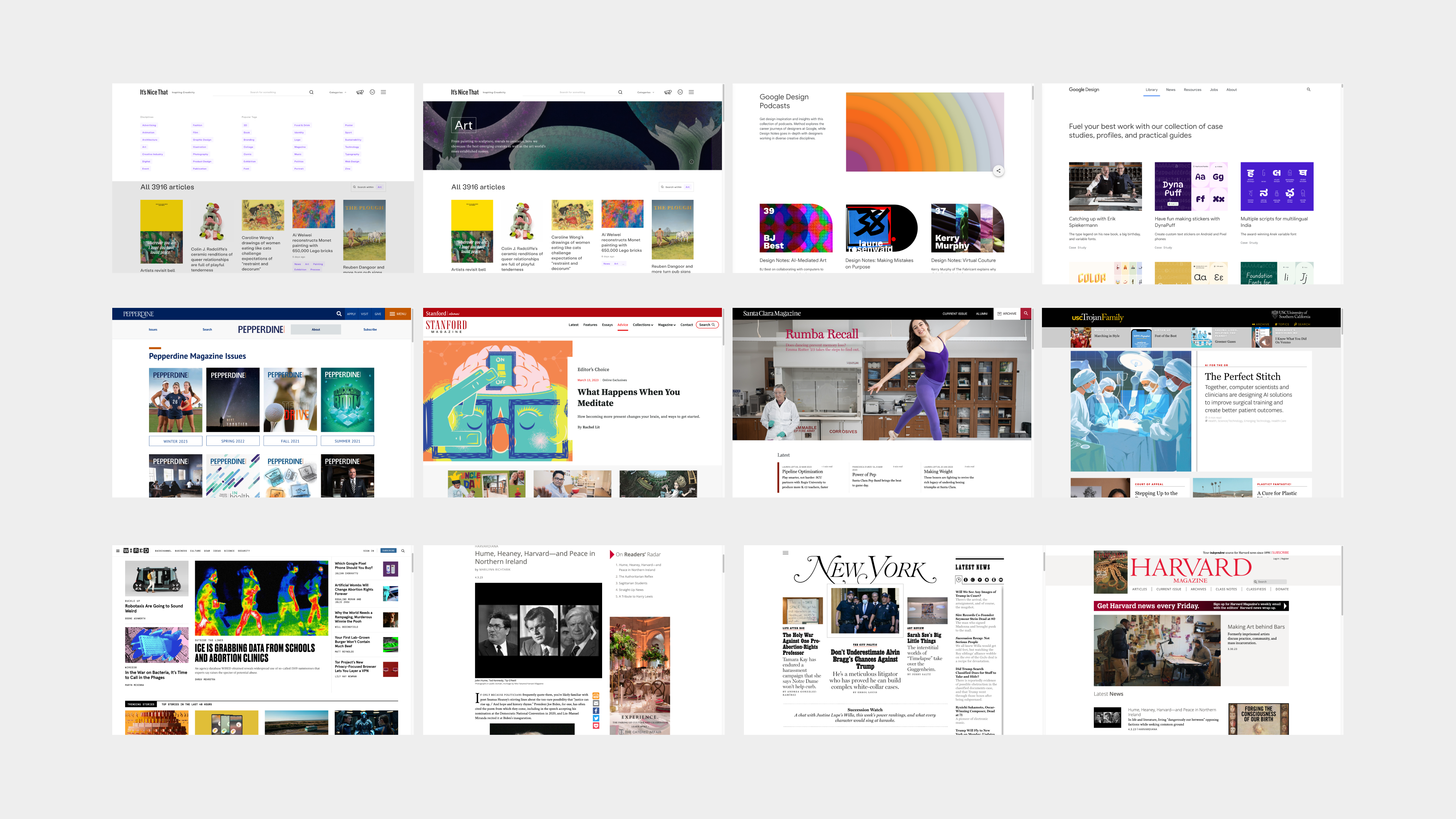
Visual research
I conducted visual research and created a mood board to gather inspiration and identify design trends. This included analyzing other university magazine websites and online publications to inform the design direction for the project.
Ideate
I utilized various design tools to create a wireframe and prototype, which were then tested through usability studies to ensure an intuitive user experience.
User flow
![]()
![]()
![]()
![]()
As part of our effort to improve the user experience of the LMU Magazine website, we conducted usability testing. In each round, we asked participants to perform a series of tasks on the website while we observed their interactions. We then analyzed the data to identify pain points and areas for improvement. Here are our findings:
I utilized various design tools to create a wireframe and prototype, which were then tested through usability studies to ensure an intuitive user experience.
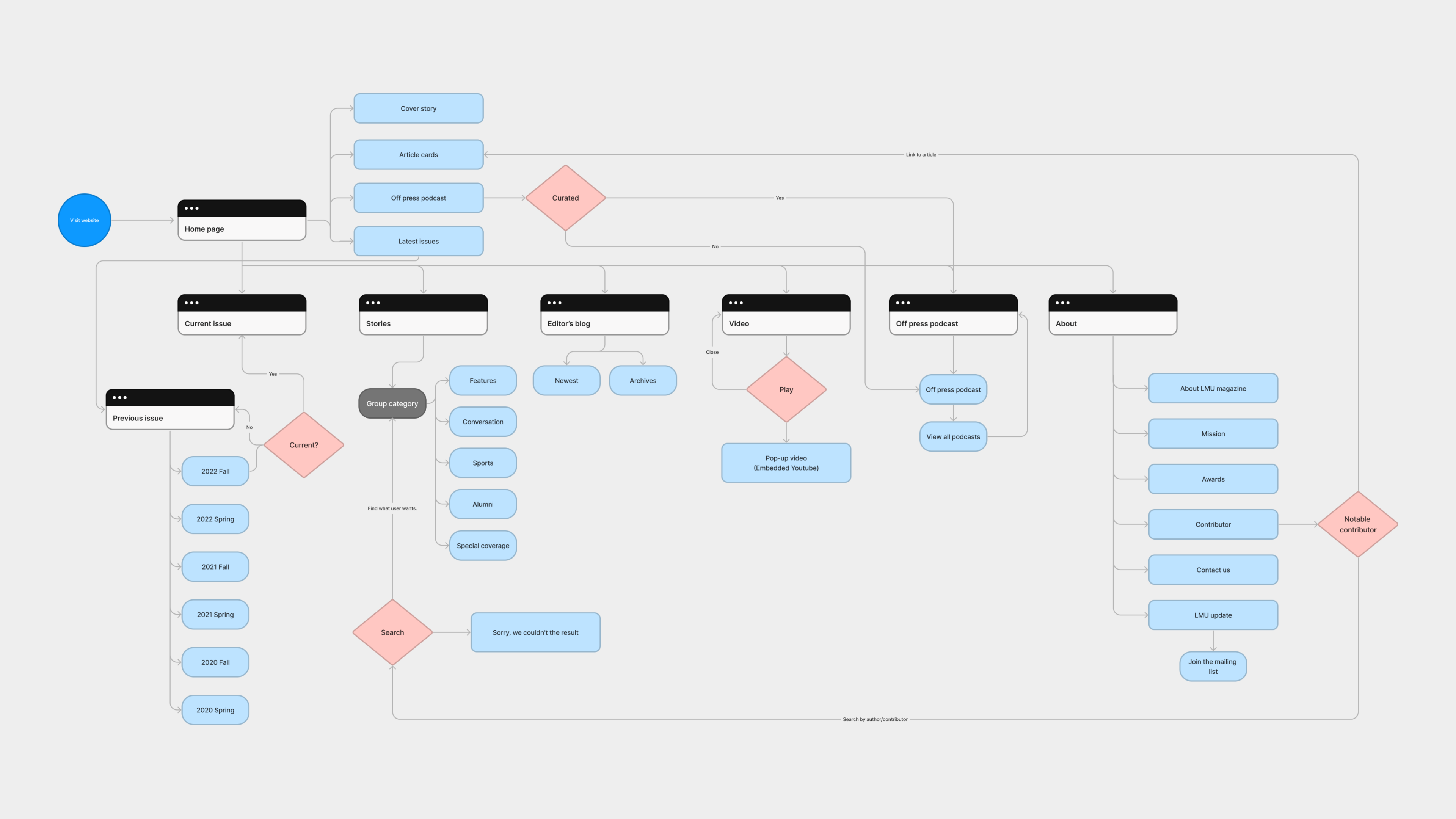
User flow
The user flow aim to ensure that each user persona can easily navigate the website to find relevant and personalized content, engage with the LMU community, and stay up-to-date on the latest news and events.
Wireframe
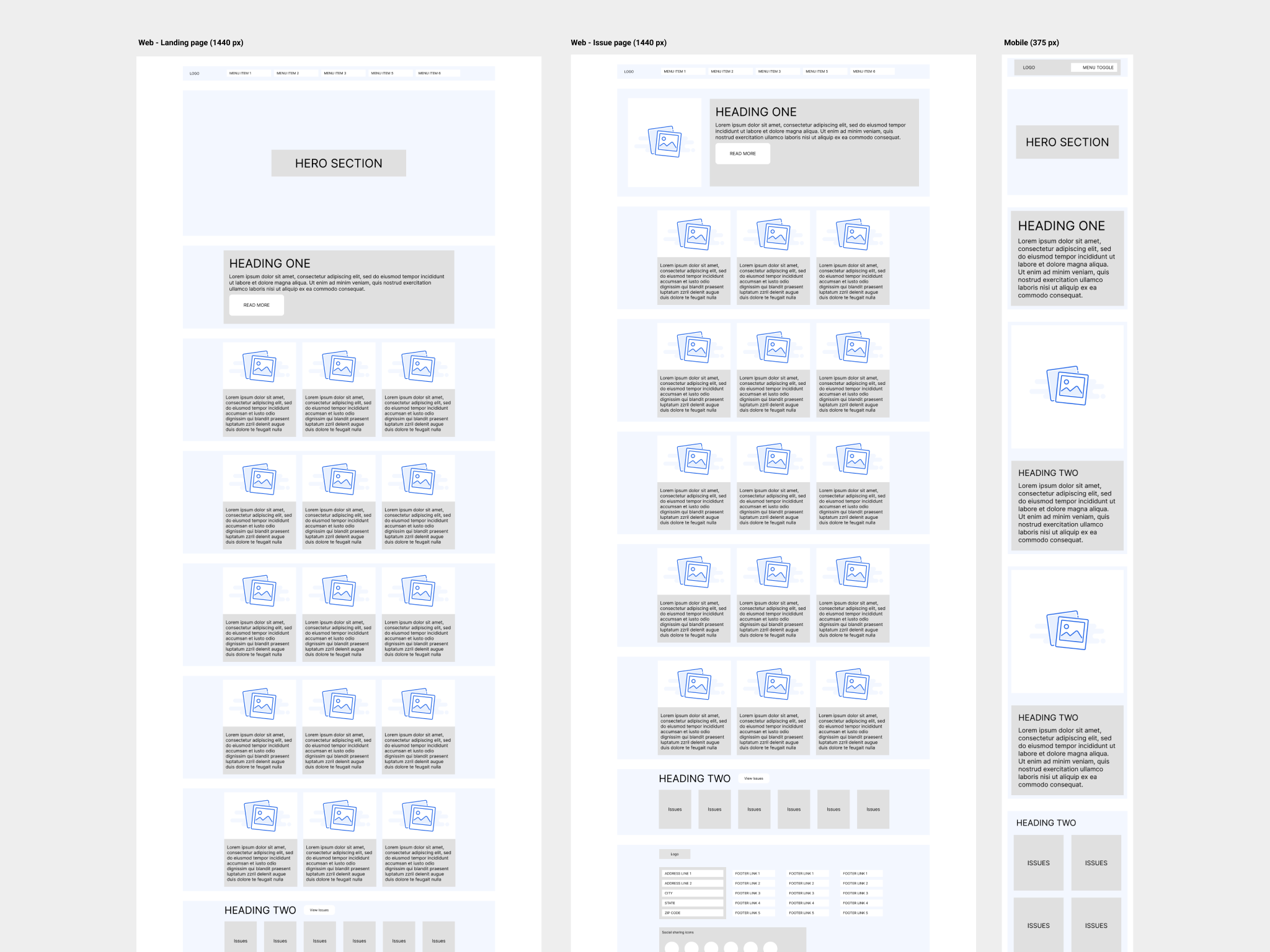
I worked on wireframes, which served as a low-fidelity representation of the site's layout, content, and functionality. The main page features the cover story and article cards, as well as the Off Press Podcasts and Latest Issues sections, all organized in a visually appealing and dynamic layout. The menu is divided into several categories and each with its own submenus and pages.
Visual design
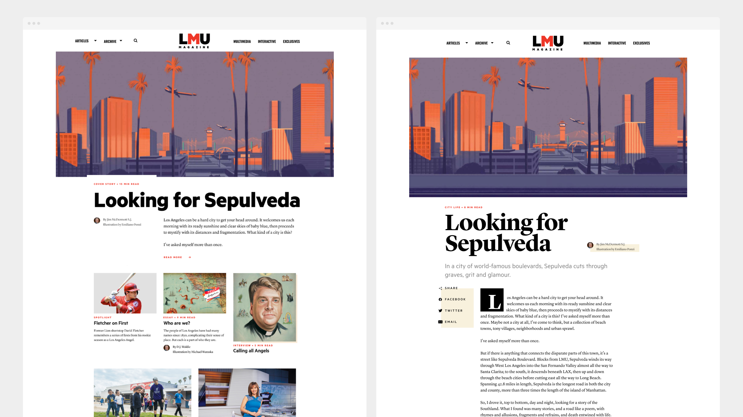
I worked on selecting a color palette and type scale that would align with the LMU branding and create a cohesive look and feel across the website. By applying a consistent design language, I aimed to enhance the user experience and strengthen the visual identity of the LMU Magazine website.

Prototype
I aimed to create a clear and intuitive navigation structure for the LMU Magazine website, allowing readers to easily find and access the content they are interested in. I organized the main page with visually appealing and dynamic layouts featuring the cover story, article cards, Off Press Podcasts, and Latest Issues sections. The menu is categorized into several options, each with its own submenus and pages, emphasizing the use of interactive features and visual elements to engage the readers with the content.
Early exploration
Usability study: findings
As part of our effort to improve the user experience of the LMU Magazine website, we conducted usability testing. In each round, we asked participants to perform a series of tasks on the website while we observed their interactions. We then analyzed the data to identify pain points and areas for improvement. Here are our findings:
Round 1 Findings
- Navigation was confusing and not intuitive for all user types.
- Some participants experienced frustration with the slow loading time of the website.
- Participants found it difficult to navigate the website, particularly when looking for specific information.
Round 2 Findings
- Participants appreciated the improvements made to the website's navigation and design, which made it easier to find information and navigate the site.
- The addition of personalized content and opportunities for engagement was well-received by participants, who felt that it added value to their experience on the site.
- Some participants still encountered issues with the website's mobile responsiveness and recommended further improvements in this area.
Refining the design
Using the insights gained from the previous rounds of usability testing, I created a high-fidelity prototype with web accessibility considerations such as ADA compliance and WCAG 2.2. The goal was to create a more user-friendly and accessible website that meets the needs of the different user type.
Backend user flow in WordPress
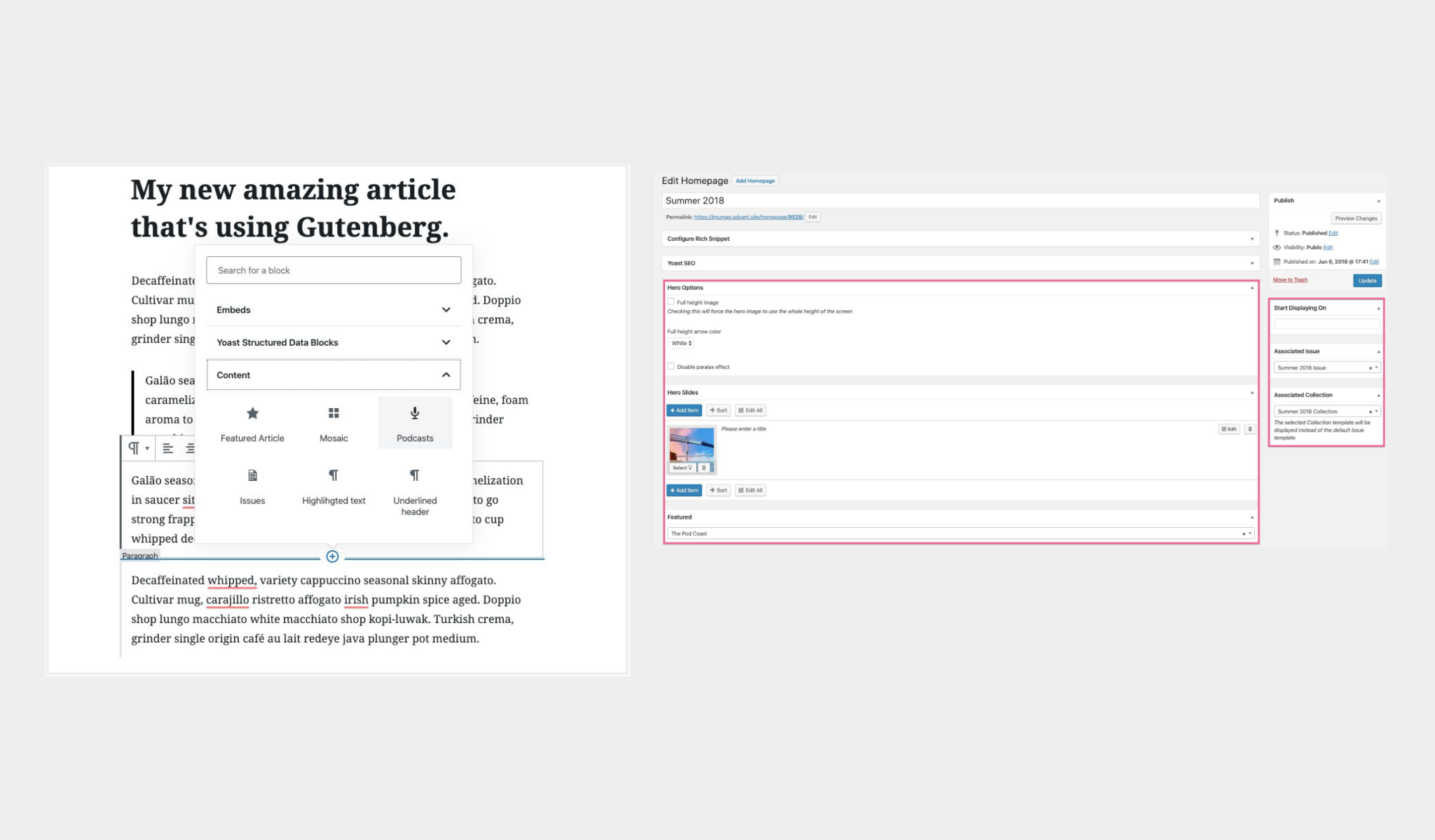
Creating a website involves not only designing the frontend user interface, but also setting up the backend content management system (CMS) that allows web editor to easily manage and update content. In this project, we collaborated with Advant interactive for a backend user flow in WordPress, which involved creating custom post types, taxonomies, and templates, as well as implementing plugins and widgets to extend the functionality of the site.
Going forward
Magazine website has received positive feedback from the participants. According to the feedback received from users, the new design is more user-friendly, visually appealing, and accessible. The new design has also resulted in increased engagement, with users spending more time on the website and exploring more content.
Takeaways
Throughout this project, I gained valuable insights into website design and development using WordPress. I learned the importance of conducting thorough user research, analyzing data, and adopting a user-centered design approach. In particular, I learned about the significance of maintaining visual coherence across related websites, as demonstrated by the LMU rebrand and how it influenced the grid, type scale, color palette, and hover effects on the LMU Magazine website. I also discovered the importance of modern design principles, such as the need for a responsive and mobile-ready website to provide users with a seamless experience across different devices. Overall, this project provided a practical opportunity for me to apply these lessons and improve my knowledge of web design best practices.
Next steps
- Conduct further user testing to validate the designs and gather more feedback from users.
- Implement the changes to the website based on the refined design and feedback from users.
- Consider implementing additional features, such as a search function or interactive elements, to enhance the user experience.
